Designing the Workspace
The Open Signal shell wasn't sketched in a design tool — four competing directions were built and rendered from the running application, bound to the live view-model, and judged as working screens. This is the direction that won, and the three that didn't.
One rail, four sections
Instead of a single crowded screen split into columns, each task gets the whole window; the rail carries only what an operator must never have to go looking for. Every question the layout had to answer got a deliberate decision:
Where does transmit live?
A persistent bar across the foot of every section — send from anywhere without navigating back.
What stays visible always?
Callsign and grid at the rail top; keyed state and audio health pinned to its foot. Nothing else earns permanent space.
How do I know a picture arrived?
A count rides the Pictures icon, so it registers from any section.
What happens while receiving?
The picture takes over the workspace, and transmit locks out with the reason written on the bar.
The shell, section by section
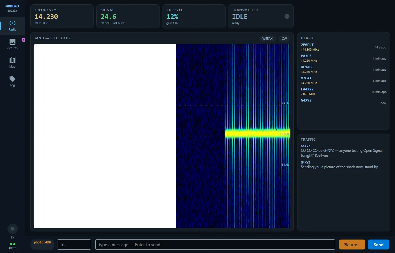
Radio — the operating screen
The four numbers that were buried in prose status lines — frequency, SNR, RX level, transmitter state — are promoted to readout tiles. Heard and Traffic share one column instead of competing with the gallery. One revision landed after using it: the study gave the whole remaining area to the waterfall, but in use the spectrum is an instrument you glance at, and the picture is the thing you are actually here to look at — so the picture takes the main area and the band keeps a strip.
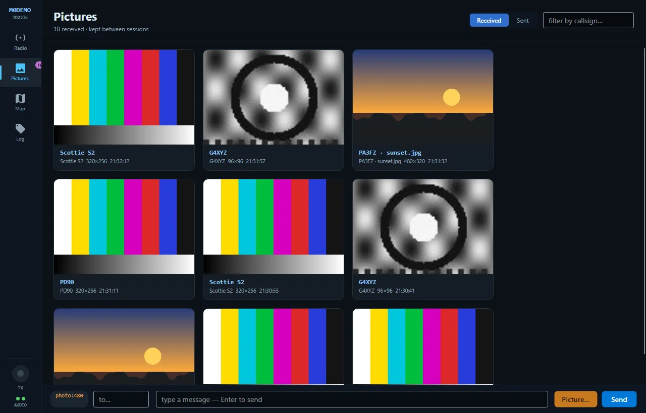
Pictures — the gallery gets the whole window
Cards carry sender, mode and size, so you can find a picture by who sent it rather than by scrolling a narrow strip — roughly three times the pictures visible at once, with a real callsign filter whose empty state distinguishes none yet from none match.
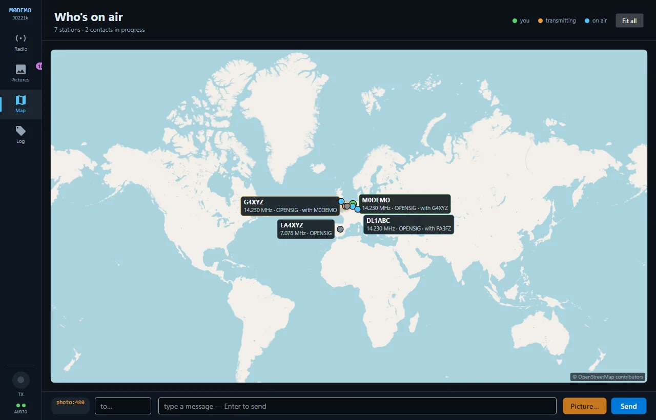
Map — a section, not a floating window
The strongest argument for the whole direction: every feature gets a home instead of another window to manage. The legend and station count move into the section header, and operator profiles open in place.
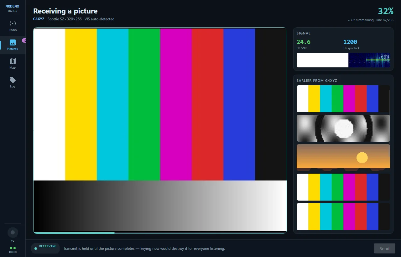
Receiving — the moment that matters
A picture arriving is the entire point of the program, so it takes over the workspace and paints in line by line instead of being a progress bar in a corner. Progress, sender, mode and time remaining read at a glance — and transmit is deliberately locked out, because keying now would destroy the picture for everyone listening. The bar explains itself rather than just going grey.
The four directions considered
Each is a different information architecture, not a different palette — all four were rendered from the running app before one was chosen.
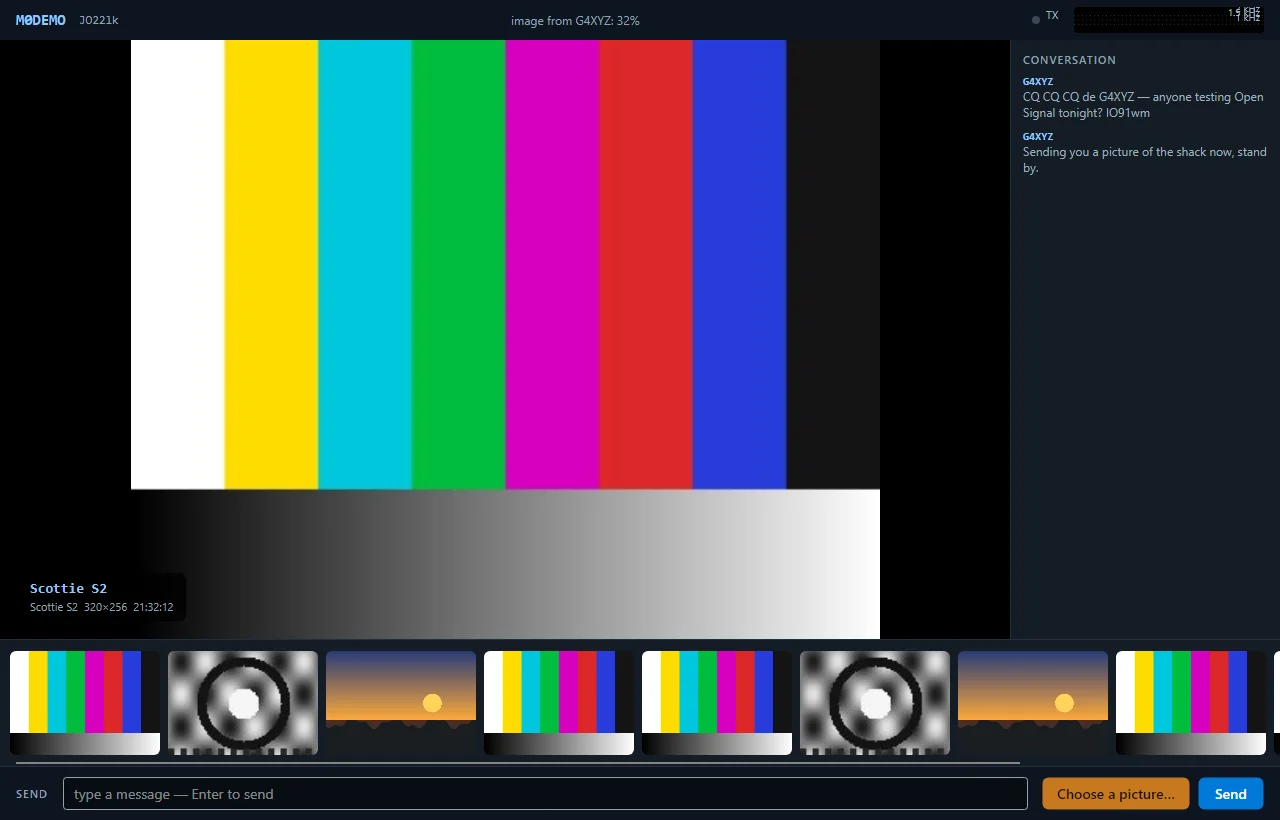
1 · Picture First
The picture goes full-bleed; the waterfall shrinks to a ribbon in the title bar.
Costs you the waterfall as a working instrument.
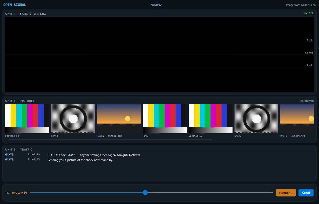
2 · Rack
No columns at all — full-width horizontal bands like a 19″ equipment rack.
Vertical space runs out fast; every band stays shallow.
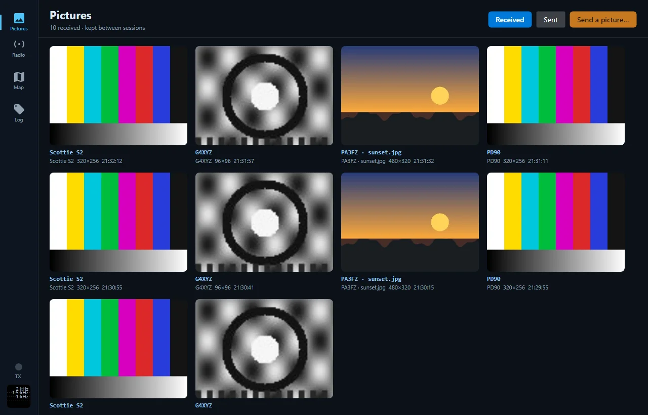
3 · Workspace — chosen
An icon rail switching one large workspace.
You can't watch the band and browse pictures at once — that's the trade.
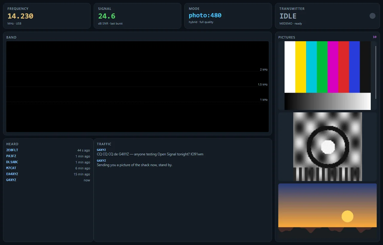
4 · Bento Ops
Nothing hides; an asymmetric tile grid sized by how often you look at each thing.
Densest of the four; wants a big monitor.
From study to shipping
The studies stood in fake numbers where no real data source existed yet. Shipping the shell meant building the honest versions:
| Study showed | Shipped reality |
|---|---|
| A hard-coded frequency readout | The rig's live dial over CAT, else the configured frequency |
| A hard-coded SNR figure | The mean SNR of the last decoded burst — “—” until something actually decodes |
| A bare filter box | A real callsign filter that distinguishes “none yet” from “none match” |
| A transmit bar per study | One bar for the whole shell, carrying the lockout reason in text |
More about Open Signal
See the Workspace in the guides
The documentation tours every section of the shell — the Receive screen, the galleries, the map — with annotated screenshots.